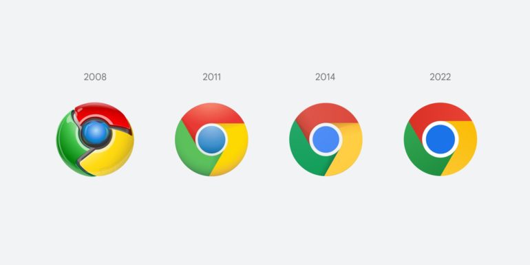

Chrome has changed its logo for the first time since 2014. If you look closely, you may see what is really different. Google Chrome designer Elvin Hu first introduces some of the ideas behind the logo redesign and the subtle changes in Twitter threads.
Instead of incorporating shadows on the borders between each color, essentially “raising” them off the screen, the red, yellow, and green are simply flat. And while not mentioned by Hu, the blue circle in the middle seems to be bigger and stares into your soul even more, but maybe that’s just my imagination.

The colors in the logo do look more vibrant (probably on account of the design team getting rid of the shadows), but there’s another change that I would’ve never noticed if I didn’t read Hu’s Twitter thread. Apparently, Google’s design team discovered “placing certain shades of green and red next to each other created an unpleasant color vibration.” To fix this and make the icon “more accessible,” they decided to use very subtle gradients — that I’m convinced the human eye can’t even see — to prevent any color vibration.
The main Chrome logo (the one you click on from your dock/taskbar to access the web) won’t look the same across all systems either. On ChromeOS, the logo will look more colorful to complement the other system icons, while on macOS, the logo will have a small shadow, making it appear as if it’s “popping out” of the dock. Meanwhile, the Windows 10 and 11 version has a more dramatic gradient so that it fits in with the style of other Windows icons. Hu says you’ll start seeing the new icon now if you use Chrome Canary (the developer version of Chrome), but it will start rolling out for everyone else over the next few months.
There are also some new icons for the beta and developer versions of the Chrome logo, with the most dramatic change being a blueprint-style icon for the beta app on iOS. Hu also notes that the design team experimented with a white line that serves as the border between each color, but found that this made the overall icon smaller, potentially making it harder to recognize among other Google apps.