Google is giving its login page a fresh coat of paint. The company recently revealed a visual redesign rolling out across web and mobile to better align with its Material Design language.
While purely aesthetic, the update aims to modernize an interface users see daily when accessing Google services. The new look launched gradually over the past week, reaching all users by March 4th.
At its core, the redesign sports a cleaner, lighter look made for diverse screen sizes, including foldable devices. Gone are clutter and shadows, replaced with more whitespace and a pared down UI some may find more pleasing to the eye.
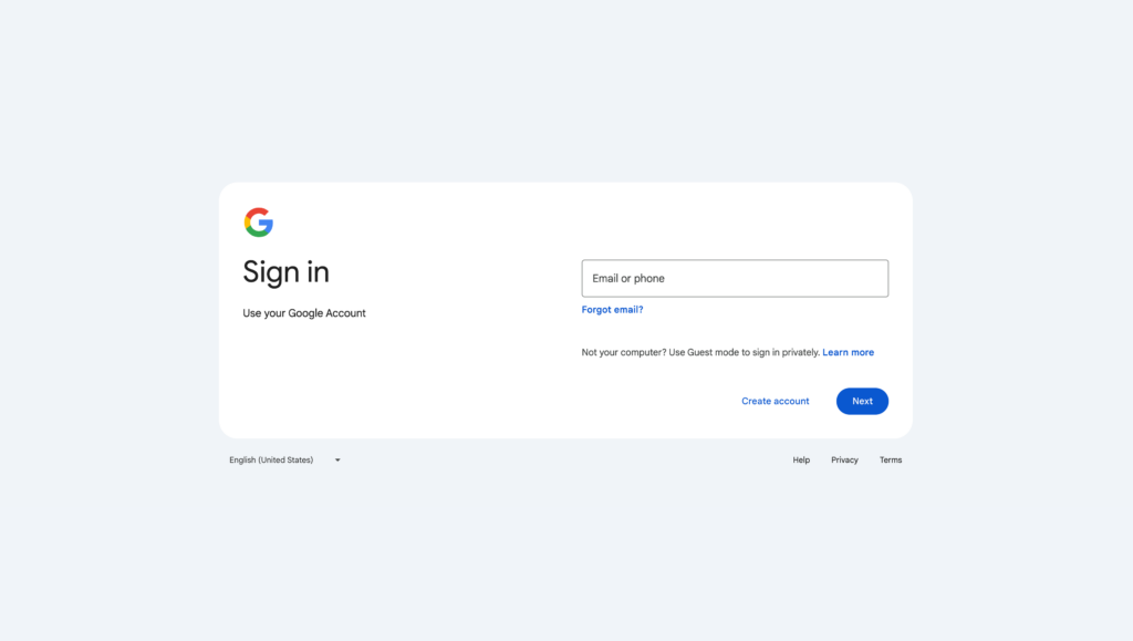
As Google notes, visual changes don’t impact functionality. Users can still expect to login normally with their Google or G Suite accounts. The familiar username and password fields remain, only now wrapped in a more stylized package.
This includes rounded profile icons, uniformly weighted text, and fluid animated effects when tapping buttons. More vibrant blues and greens update the old color scheme as well.
It’s a fairly subtle refresh rather than a dramatic overhaul. But for an interface so ubiquitous, even minor tweaks can feel significant, especially initially.
As with any visual redesign, reception is subjective. Some may appreciate the modernized aesthetics, while others preferred the older version or don’t notice much difference.
Regardless of opinion, the update signals Google’s continual efforts to refine and polish products to better meet contemporary user expectations and sensibilities.
Given Google’s reach, its design choices often set visual trends that others follow. So while the login makeover itself is minor, it hints at wider stylistic shifts on the horizon across the company’s ecosystem of products and services.