
Google Maps users may have already noticed a significant visual makeover on the popular mapping app. While there hasn’t been an official statement from Google, observations from users and tech enthusiasts suggest that the changes are rolling out. It’s unclear whether this is a testing phase or a permanent update.
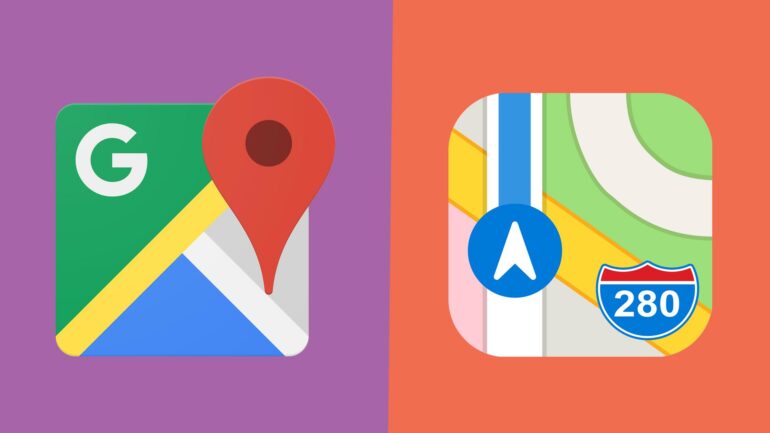
The most noticeable alteration in the revamped Google Maps is the color scheme. It now features gray roads against a white background, a shift from its previous white roads and gray backdrop. The blue color used for oceans and lakes has been brightened, reminiscent of Apple Maps’ style.
Additionally, the shades of green on the maps are now darker, and the navigation route arrow has transitioned to a darker blue hue, departing from its previous lighter blue shade. The arrow can also change colors based on traffic conditions, turning yellow or red when necessary. The bottom bar of the app has undergone changes as well, featuring a smaller set of tabs below the map.
This visual refresh appears to be the most significant update to Google Maps since 2020, following a previous revamp in 2017. However, not all users have received the update yet, indicating a staggered rollout.
If you haven’t experienced the new look, consider updating your Google Maps app, as it might not be available to all users simultaneously.
The adoption of a color scheme reminiscent of Apple Maps is noteworthy. It suggests a shared understanding between Google and Apple regarding the most user-friendly color palette for map interfaces. Such similarities can also facilitate users switching between the two mapping services seamlessly.
Should Google make an official announcement regarding these changes, we will provide updates in this article.