
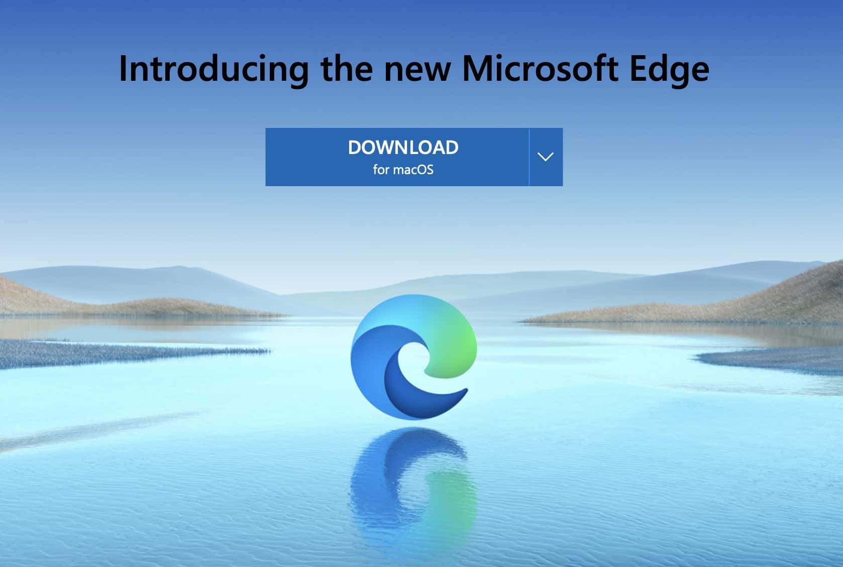
When Microsoft released the new version of the Edge browser, they performed a complete overhaul. The engine was changed ot the Chromium engine. The features were turned up to eleven, and to top things off, they even gave the Microsoft Edge browser, a brand new logo.
When the new Windows 10 OS was launched, it came with the first version of Microsoft Edge, which just a normal upgrade on the Internet Explorer browser, while the logo also stuck to pretty much, a changed version of the logo that represented the browser in the past.
However, when the news was confirmed that Microsoft was indeed working on a new version of Edge, the social media universe saw a bunch of teaser images from the team at Microsoft regarding an easter egg game and some waves.
In a few days, the new Microsoft Edge logo made its debut, and the first thing that it did, evoked a hugely positive reaction from fans.
What worked out even more for the new branding effort, wad the fact that the Chromium-based Edge browser was actually going toe to toe against the Chrome browser, in terms of performance, and now, the logo was giving Google’s counterpart, a tough contest as well.
One glance at the new Microsoft Edge logo, and you will see that Microsoft has stuck to the blue colour theme of the previous browser versions, but beyond that, the logo is a complete overhaul.
The wave-like shape does resemble the alphabet ‘E’, but its a totally new and modern take on the logo nonetheless. The fluid design of the logo truly embodies how smooth the new browser is in terms of visual performance as well as its raw speed.
The logo also looks a lot better as an icon on your smartphone or PCs and even as a brand logo, it evokes a sense of confidence and robustness, that was previously unseen in the Edge browser logos.
If you have not yet expeirenced the new Edge browser, you can download it for free by clicking here.