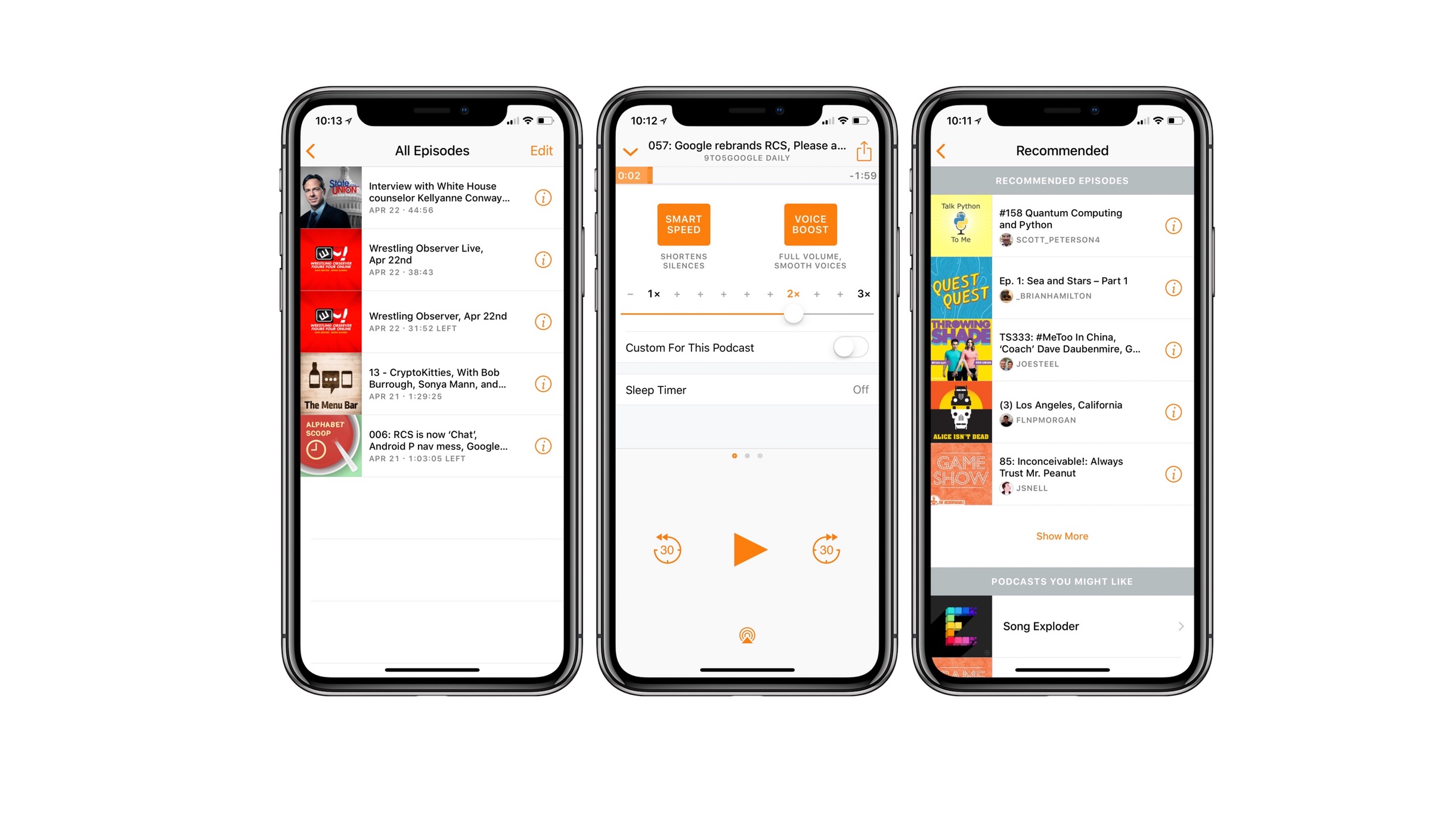
Overcast, a popular podcast player for Apple devices, is receiving an upgrade that includes a big redesign of its main page and a new theming system that allows you to customise the app’s colours. For myself and other Overcast users, the update is a new coat of paint on an already well-made programme, and power users will likely discover a slew of additional changes and settings that will make the app even better suited to their use case.
The app’s developer, Marco Arment, writes in a blog post that the 2022.2 version, which will be ready for download on Friday, is the “biggest overhaul” the app has ever had and promises some interesting future improvements.
The improvements are immediately noticeable when you launch the app — there’s a new Recent carousel that allows you to instantly resume previous episodes and see which podcasts have new episodes (you can even long press on the tiles for additional options), and the layout is packed with fresh symbols. Playlists, which are located at the top of the screen, have been completely redesigned: they now appear as configurable colourful bubbles with icons, rather than as grey rectangles, and you may create playlists that display all of your queued, starred, downloaded, or in progress episodes.
If you wish to add any of those pre-made playlists to your home screen, you can easily do so using the Add Playlist option – and if you don’t, you can completely ignore them. (If you’re not a fan of the recent bar, the Add Playlist menu also contains the option to conceal and show it.)
Your podcasts are listed below the playlists and the Recent section. The old design included categories for Playlists, Podcasts, and Recently Played Podcasts on the home page. The latter two have been replaced by a list that allows you to toggle between three modes: Inactive, Active, and Unplayed. Unplayed displays podcasts with unplayed episodes, active displays all podcasts you’ve subscribed to, and inactive displays “podcasts you’re not following that haven’t added any new episodes or appear to be dormant.” (The UI also has a nice tiny moon icon for those podcasts.) Additionally, you can pin shows to keep them at the top of the list.
Apart from the improved capabilities, the app also looks better. I wouldn’t say Overcast has ever looked horrible, but the update gives it a much more current vibe. Arment highlights updating the app’s typeface and spacing, but the most intriguing improvement is the implementation of a new theming system. You may keep Overcast’s light-mode orange and dark-mode blue colours if you choose, but I expect a lot of people will appreciate the ability to browse the palette of available colours and choose something different — and yes, you can have different colours for when the app is in light or dark mode.
Friday’s update is primarily focused on improving the experience of maintaining your podcast library – when you go to play one, the design will remain essentially unchanged from the previous version, with the exception that the theme colour you choose will be utilised throughout. Arment does promise, though, that the now playing and individual podcast screens will receive a facelift in a future version, so there is something to look forward to.


