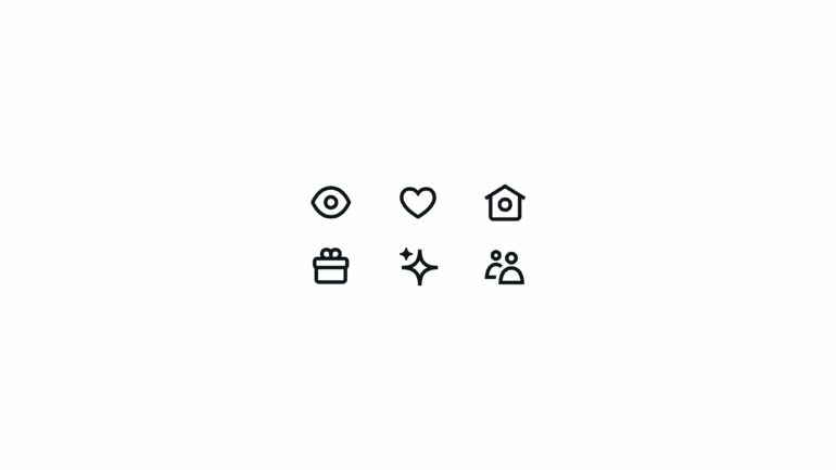

Twitter is adopting a new style for the social network’s symbols, the company said in a discussion on its design account on Friday. The icons seem to have somewhat broader lines, and everything appears to be more angular.
“The objective was to develop a consistent collection of symbols that are bold in form and design while being accessible and a touch cheeky when feasible,” Twitter said in the post. Two tweets from the discussion make it clear what has changed. This one depicts how they used to look and how they look today. The one after that shows a slew of them all in one shot.
Good is good but better is better.
That’s why we’re introducing our brand new icons.
Let’s talk. ? pic.twitter.com/xmkaQr5zkQ
— Twitter Design (@TwitterDesign) October 21, 2022
Twitter will make the new symbols accessible to all users on the web, iOS, and Android “in the coming days,” according to spokesman Shaokyi Amdo in an email. They may already be in your possession; they surfaced on the web last night and in the iOS app as I was writing this piece.
The updates follow the launch of the company’s new visual design language in August 2021, which includes the introduction of the Chirp typeface throughout the app.