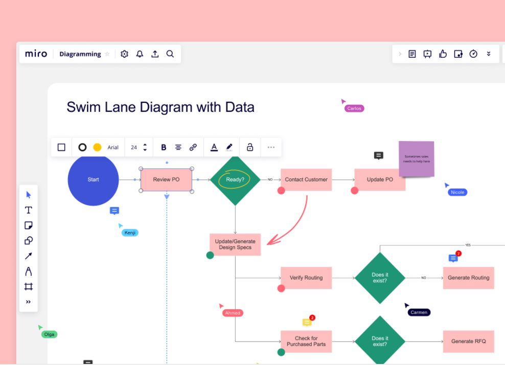
Presenting complex data, whether in a PowerPoint presentation or a written document/report, can be tricky. There is a risk that the data will be unintelligible, and your audience baffled. When this happens, the core message you are trying to impart is lost in translation. One way to ensure data is understood and intelligible is to present it in the form of diagrams.
Table of Contents
Diagrams are a Powerful Tool
There are lots of tools to make creating diagrams easy, such as the diagramming tool from Miro. From flow charts to line graphs, diagrams can be inserted into all kinds of documents, in business, education, medicine, and almost any field imaginable.
There are many different kinds of diagrams, and all have an important role in the presentation of complex data. Using an example, let’s look at why this is the case.
The Advantages of Using Diagrams to Present Complex Data
Imagine how much raw data you would have if you analyzed population migration between all EU member countries within ten years. The data would be so dense, that nobody reading it would be able to see patterns or trends, let alone understand it. But if you crunch the numbers and present the data using charts and other diagrams, it is instantly much easier to make sense of the figures.
Most people can grasp data much faster when it is presented to them as a diagram. This is why media outlets often use diagrams and charts to present the data harvested from research studies and censuses. Elections are a good example of the way charts and diagrams are used to illustrate voting trends. The general public has zero interest in multiple pages of data, but they will pay attention to a simple bar chart that shows which party is in the lead.
Complex data can be simplified when presented as a diagram. It takes up less room on the page or on-screen. It can also reveal hidden trends that might not be obvious from a table of figures. In addition, diagrams may show relationships between different sets of figures which, again, might not be obvious when scanning the data.
Diagrams are a universally accepted way of presenting complex data. Most science and business fields use diagrams to present data. It’s the easiest way to get complex information across to an audience.
The media loves to use diagrams because aside from the fact they make complex data easier to understand, they also look more attractive on the screen or the pages of a magazine. Our eyes are naturally drawn to images rather than text. A large, colorful diagram illustrating some complex data within an article will catch the eye whereas the reader would undoubtedly skip over a page of dense figures without reading the text unless they were extremely interested in the topic.
The Disadvantages of Using Diagrams to Present Complex Data
While there are clear advantages of using diagrams to present complex data, it is important to be aware of the disadvantages too.
Diagrams simplify complex data, but there is a danger that they simplify the data too much. For example, if a media site wants to present data from the aforementioned example of migration patterns across EU member countries over 10 years, it’s clear that diagrams are very useful to the average reader, who would struggle to make sense of such complex data. But if this data is part of a research study being presented to fellow academics and researchers, simple diagrams are more limited. Experts may draw inferences from diagrams, but they will still want to see the raw data to grasp the exact nature of migration trends.
The problem with diagrams is that they can only present limited information. Oftentimes, tables are needed to provide more detailed information. Diagrams do play an important role, but they can prevent the reader from analyzing the data further if it is not included with the diagram.
Multiple data fields cannot always be presented via a simple diagram or flow chart. This makes it hard to present numerous characteristics from a data set. Diagrams may misrepresent the data if only some aspects of the data are cherrypicked to illustrate a particular viewpoint. This sometimes happens in the media when conscious or unconscious bias influences how a story is presented to the public. This link offers a few notable examples of how diagrams have been used to mislead the public.
How Can Diagrams be Used More Effectively?
There are many different types of diagrams, so it’s important to select the right one when presenting data.
Flow charts are often used in project management, to show the lifecycle of a project and the tasks involved at each stage.
Bar charts and line graphs are popular ways to present data pictorially. These are commonly used in business to show financial data in a meaningful way, such as interest rate rises and falls, unemployment trends, and historical values of the Dollar or Pound. They can be used to illustrate positive and negative data trends.
Let’s not forget the pie chart, which most of us will have seen in school. The whole pie represents all the data being analyzed, and the individual slices represent sections of the data.
Do not underestimate the power of diagrams in illustrating complex data. Whether you need a flow chart for your next sales campaign or a bar chart to help readers understand complex financial trends, diagrams are universally accepted and easy to understand.


